Omeda

Journey Builder: Marketing Automation

Challenge

Omeda’s Newsletter & Marketing Automation platform (Journey Builder) had an outdated UI and was not intuitive for new users following onboarding

Intention

Modernize the user interface to align with contemporary SaaS standards and minimize user friction, resulting in a more seamless user experience

My Role

Lead Product Designer (Owner)

Tools

Figma

Redesign Goals

  • Reduce cognitive load by removing ambiguous icons and adding labels
  • Soften the platform’s color palette and introduce a modern gradient-based design system
  • Increase user efficiency by streamlining the creation and management of enterprise-level marketing campaigns

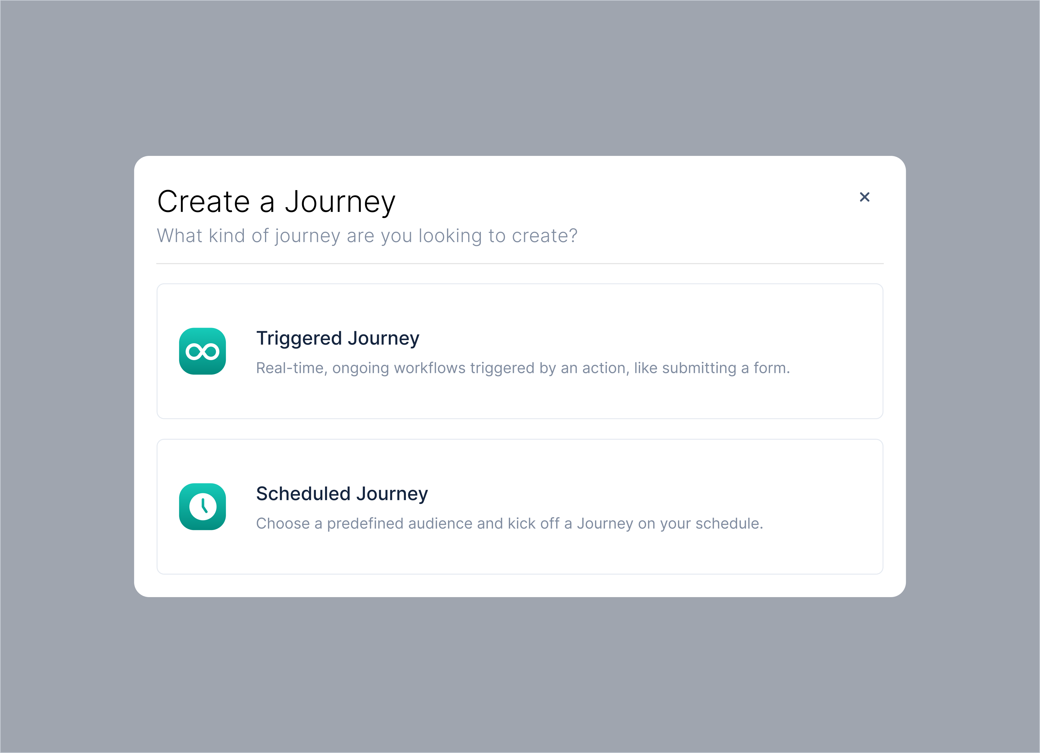
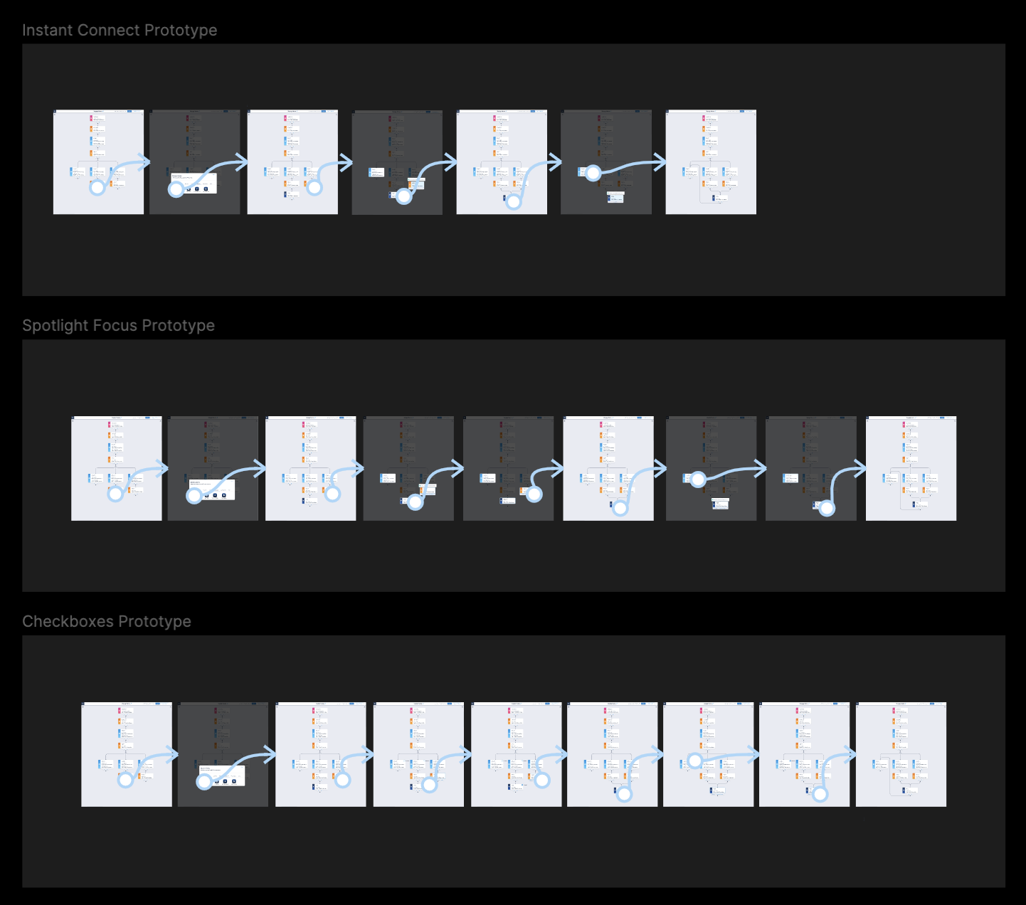
Sneak Peak of Results

Before and after my redesign  

Screenshots of three bank "mortgage pages": Citi.com, Rocketmortgage.com, and chase.com

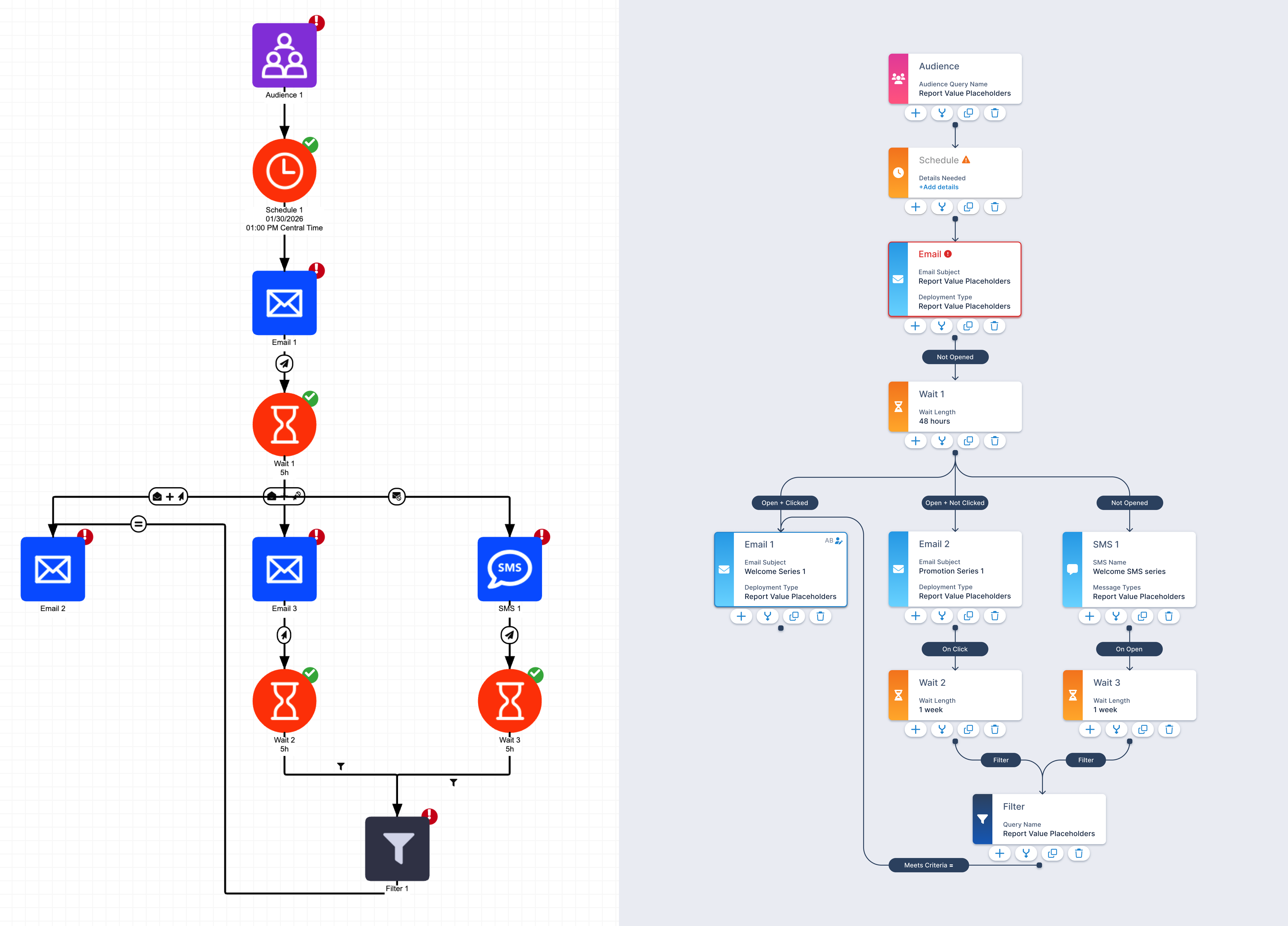
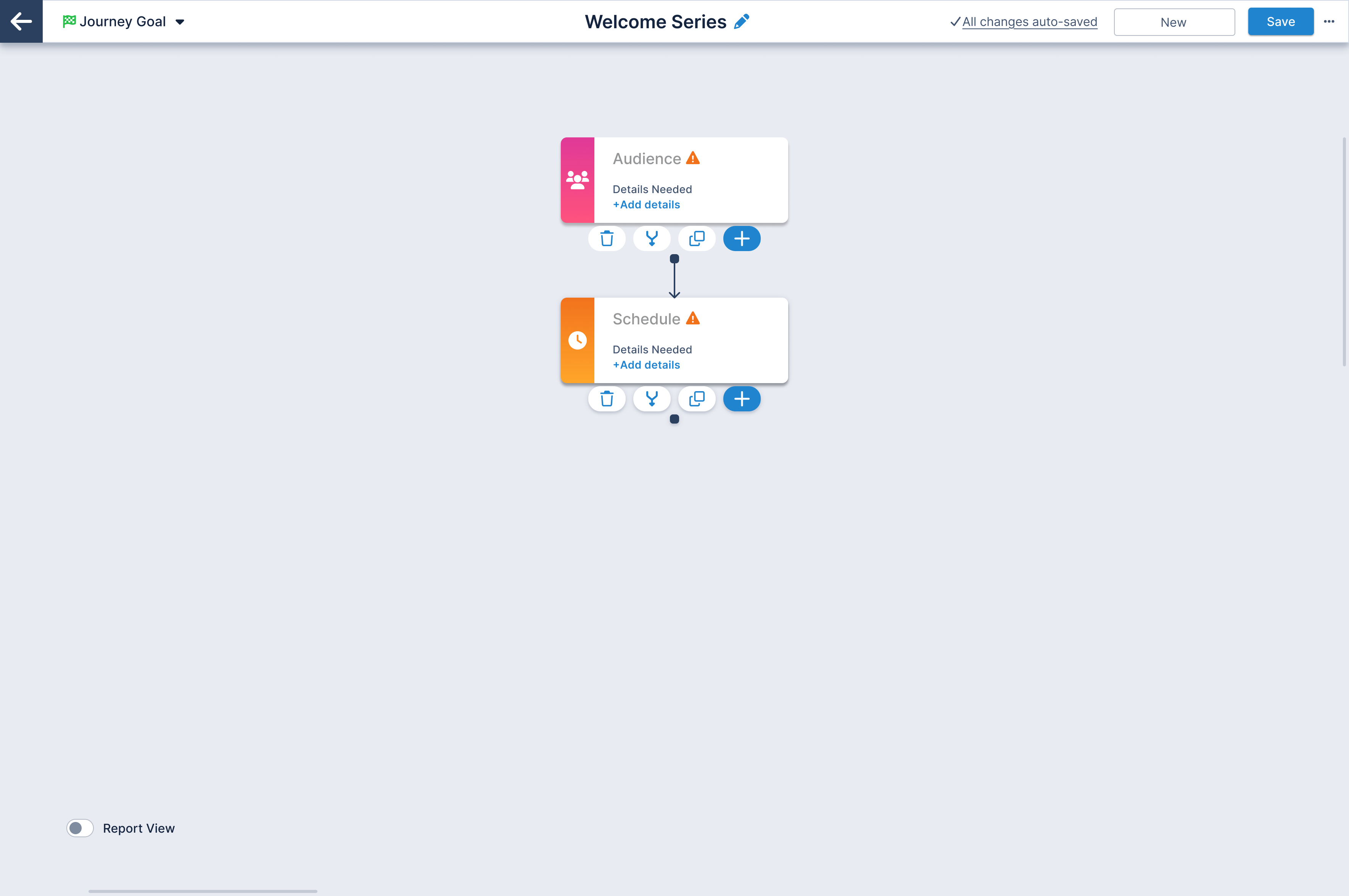
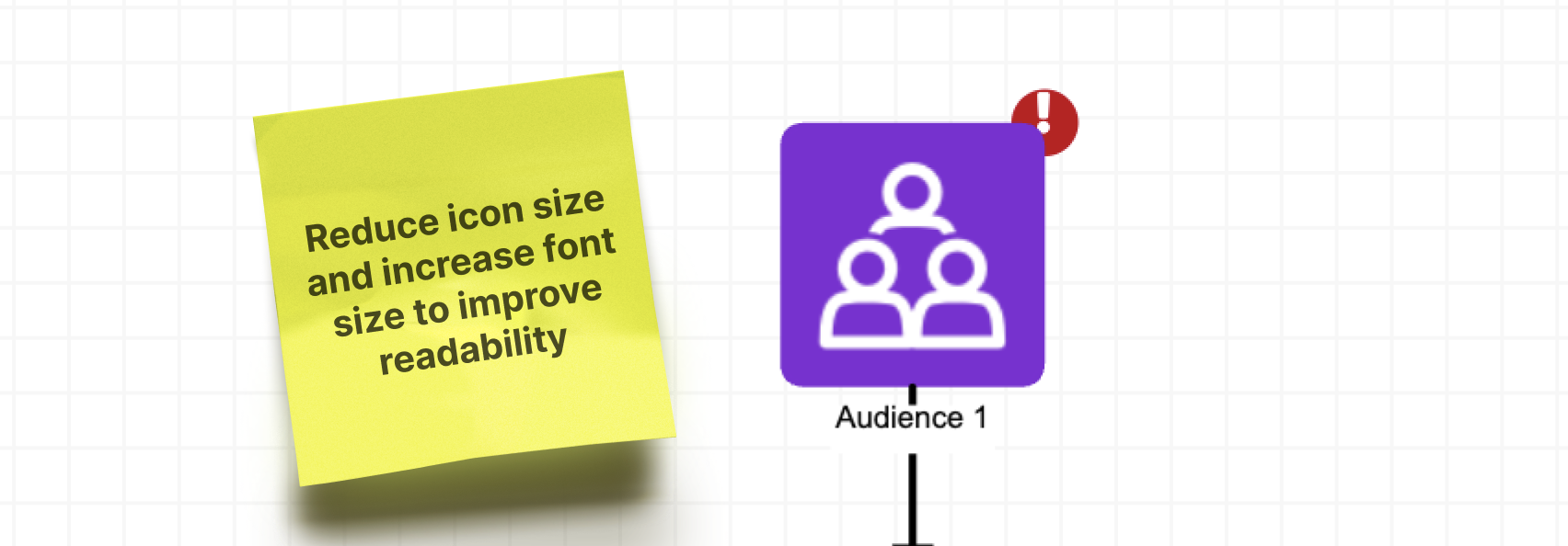
UX Audit: Original Design

Conducted a strategic UX assessment to identify high-impact usability issues and user pain points across core complex workflows. The findings guided design decisions and helped prioritize enhancements that reduced friction and improved product on-boarding.

Complicated and confusing iconography

Screenshot of U.S. Bank hero image section with the header "We've made big improvements to your mortgage experience. Screenshot of U.S. Bank hero image section with the header "We've made big improvements to your mortgage experience.

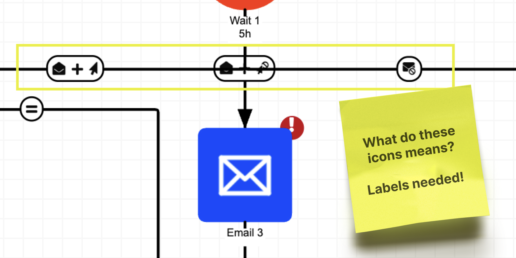
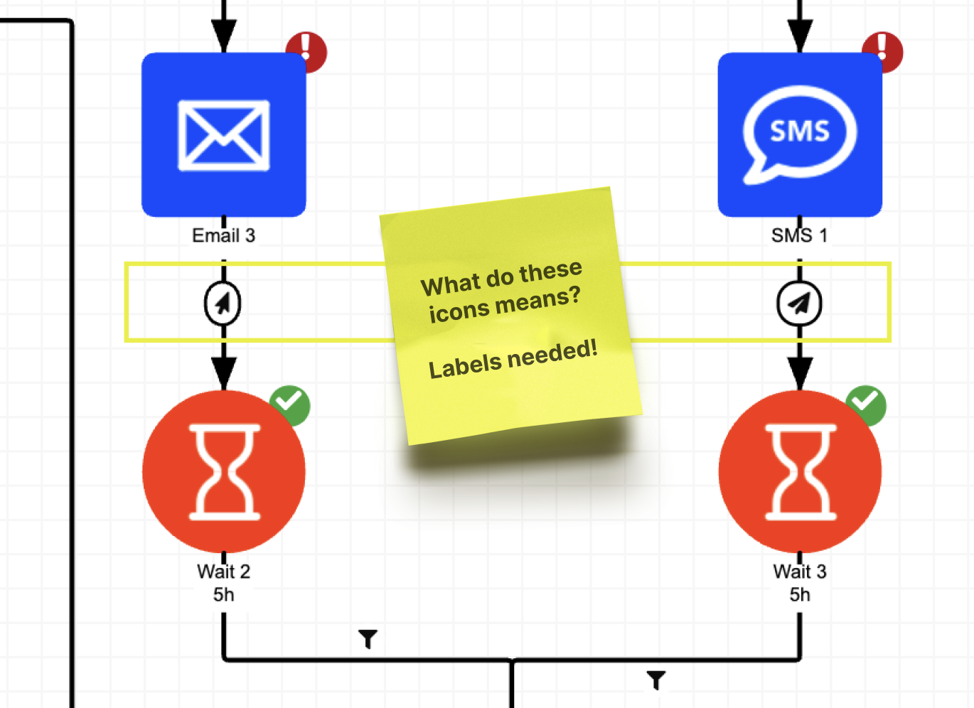
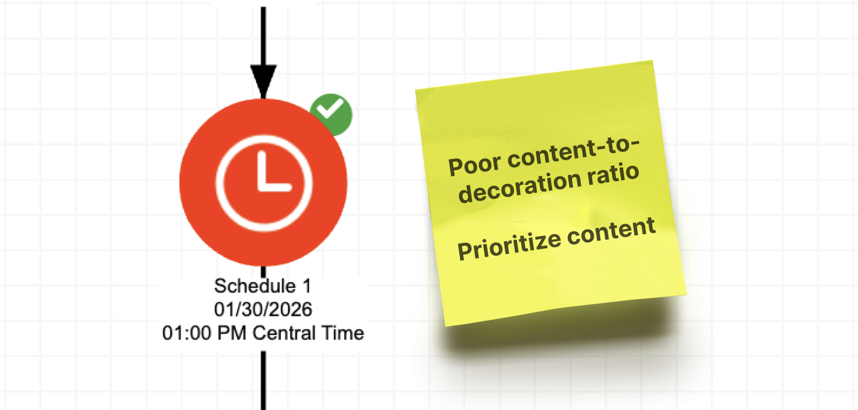
Inefficient use of screen real estate

Screenshot of U.S. Bank hero image section with the header "Manage my mortgage: Understanding your U.S. Bank mortgage".Screenshot of U.S. Bank hero image section with the header "Manage my mortgage: Understanding your U.S. Bank mortgage".

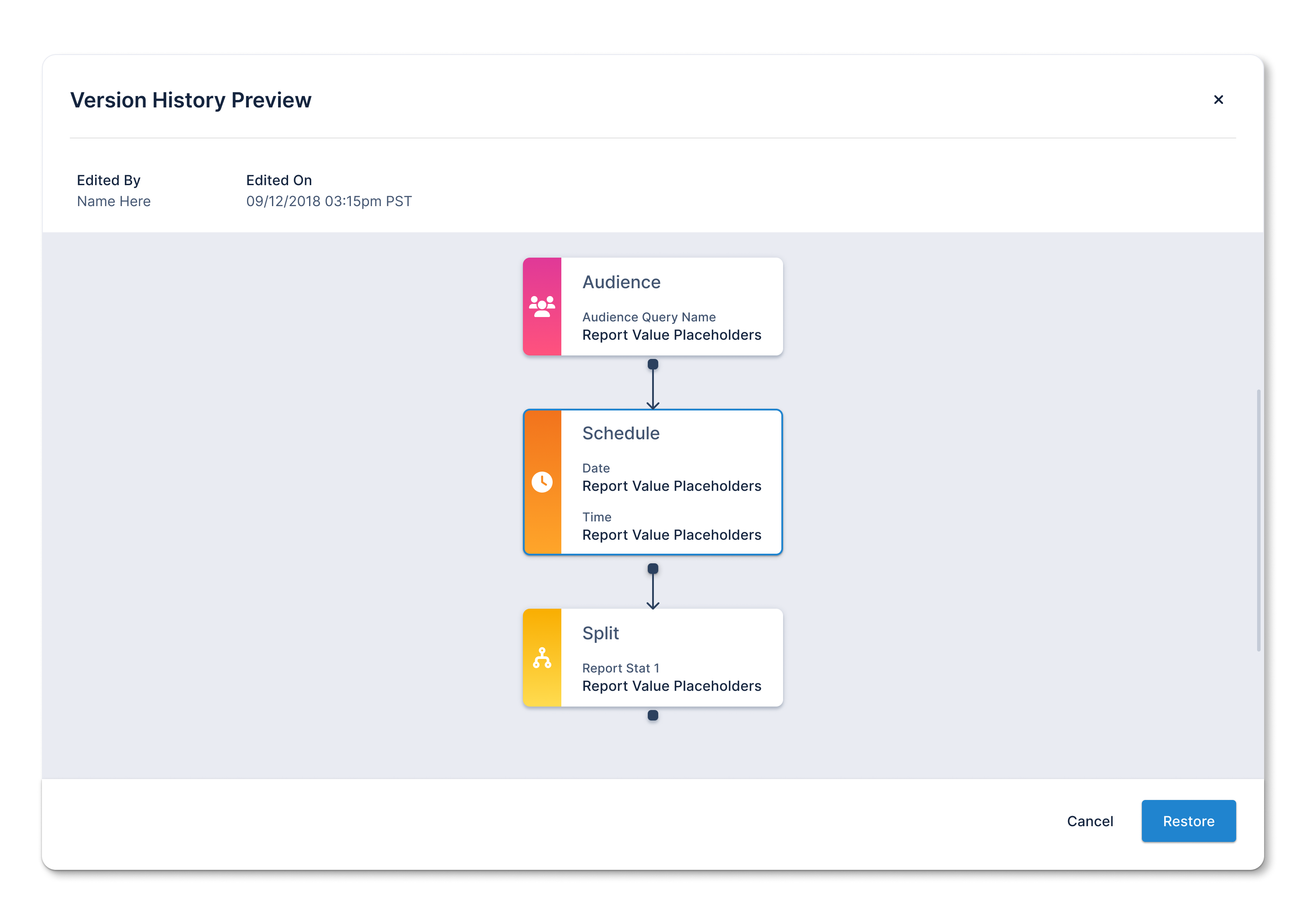
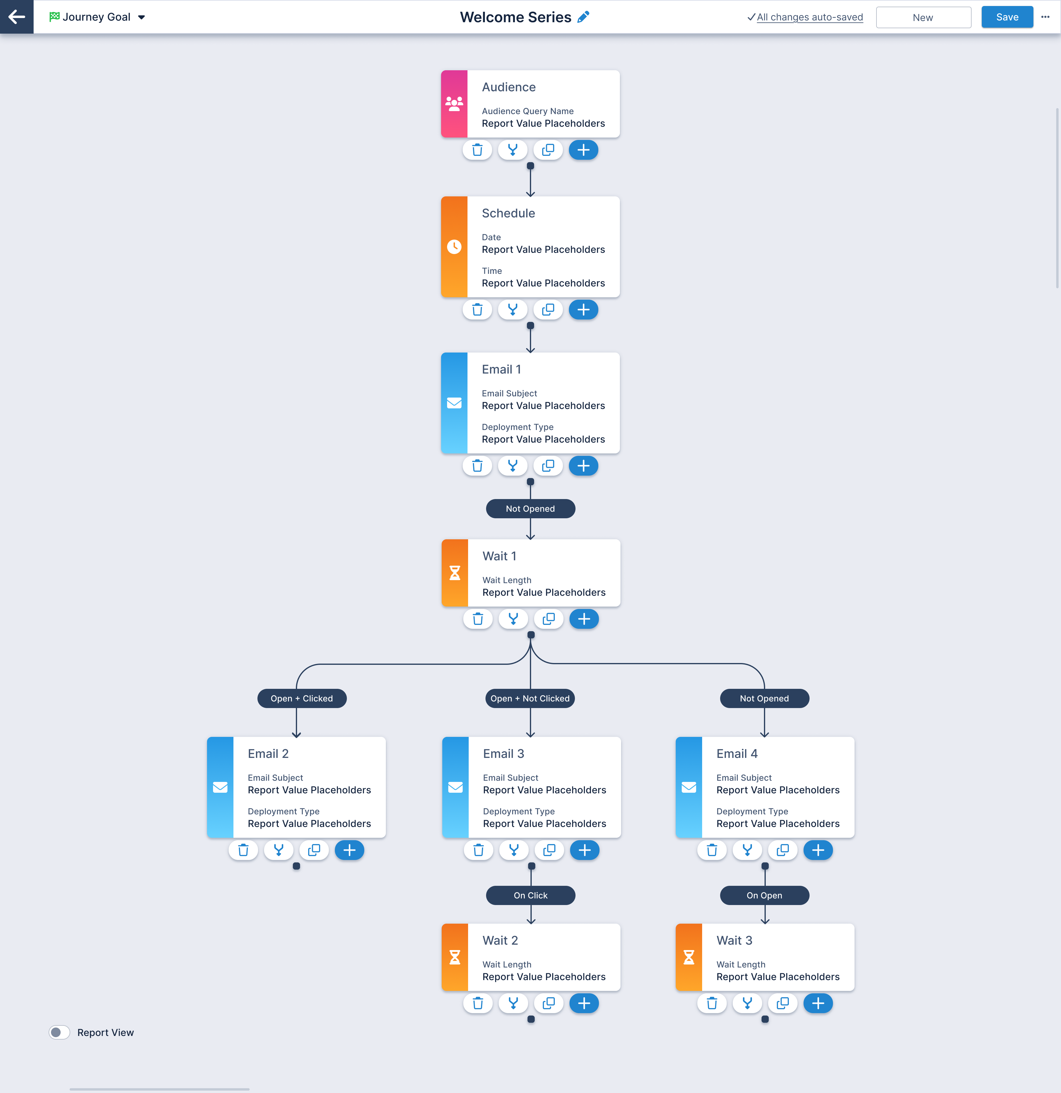
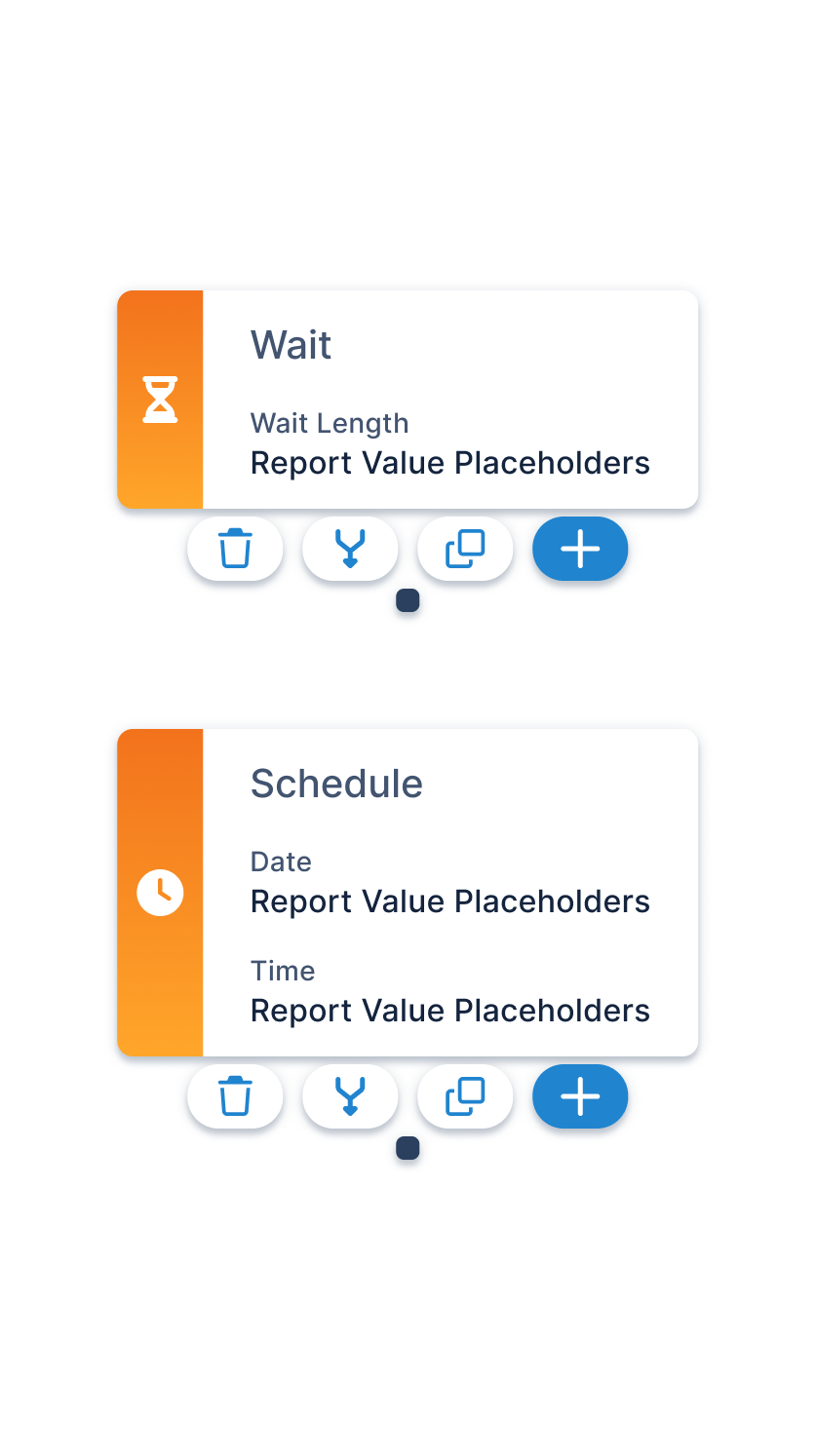
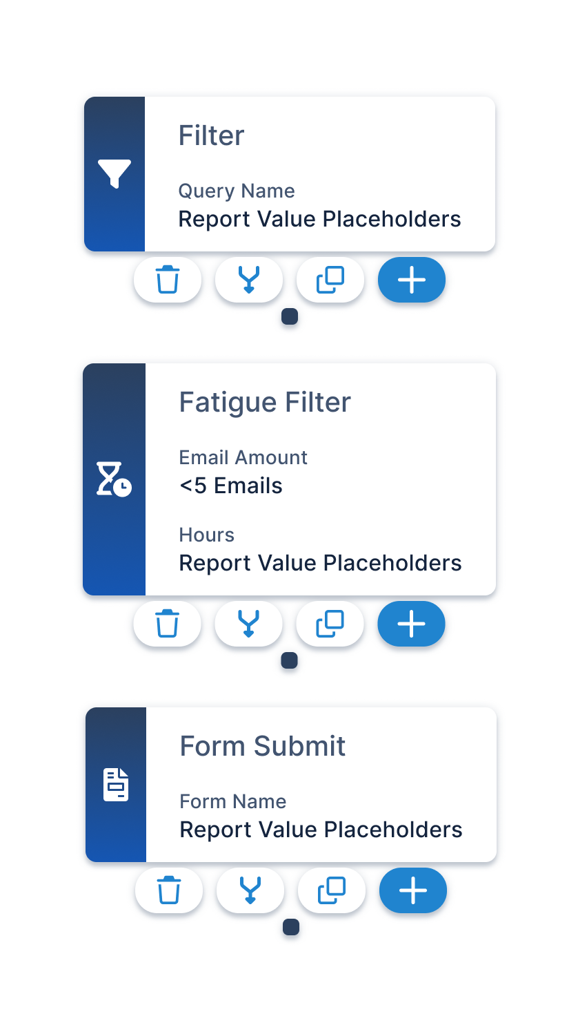
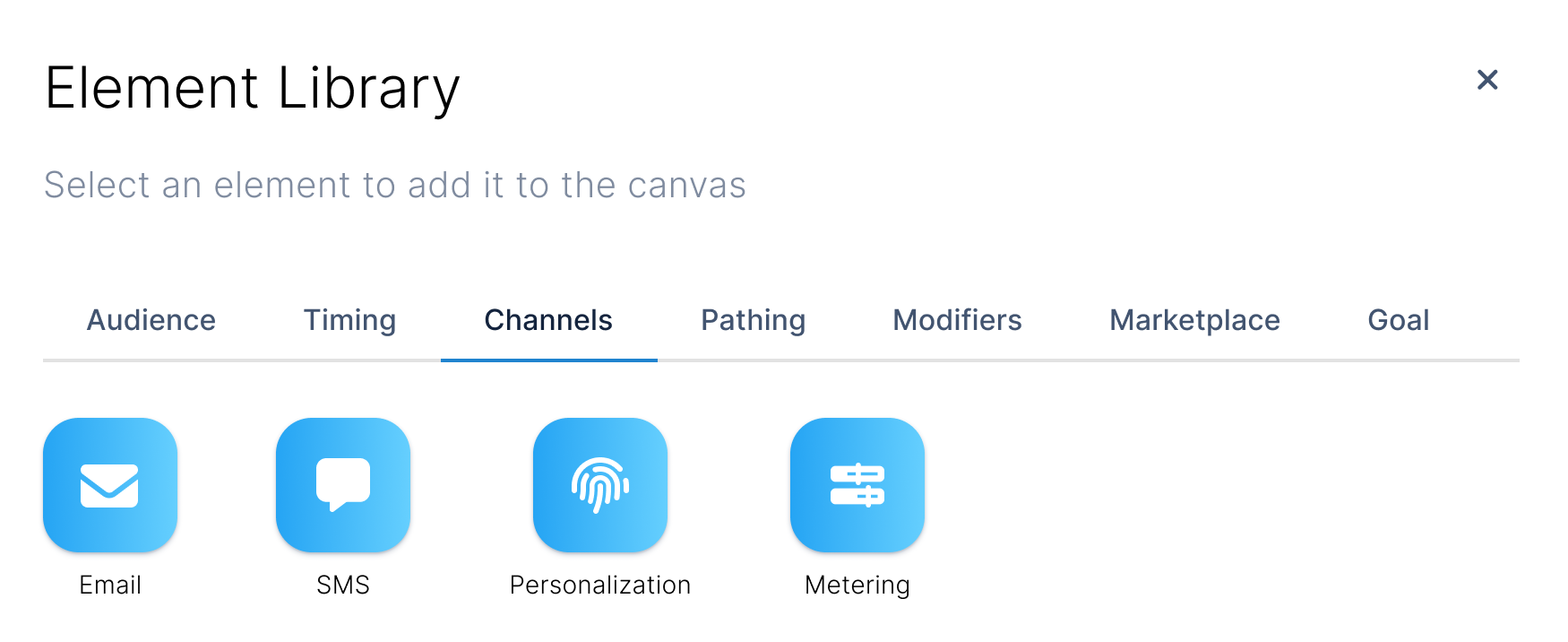
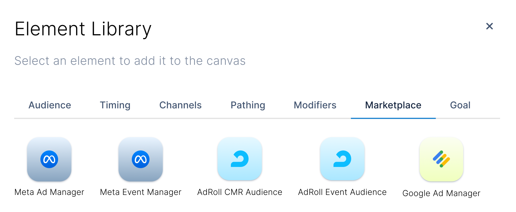
Campaign Builder Cards

Redesigned 20 campaign builder element cards with enhanced labeling, improved information hierarchy, and a sleek, modern visual design to increase usability and reduce user confusion.
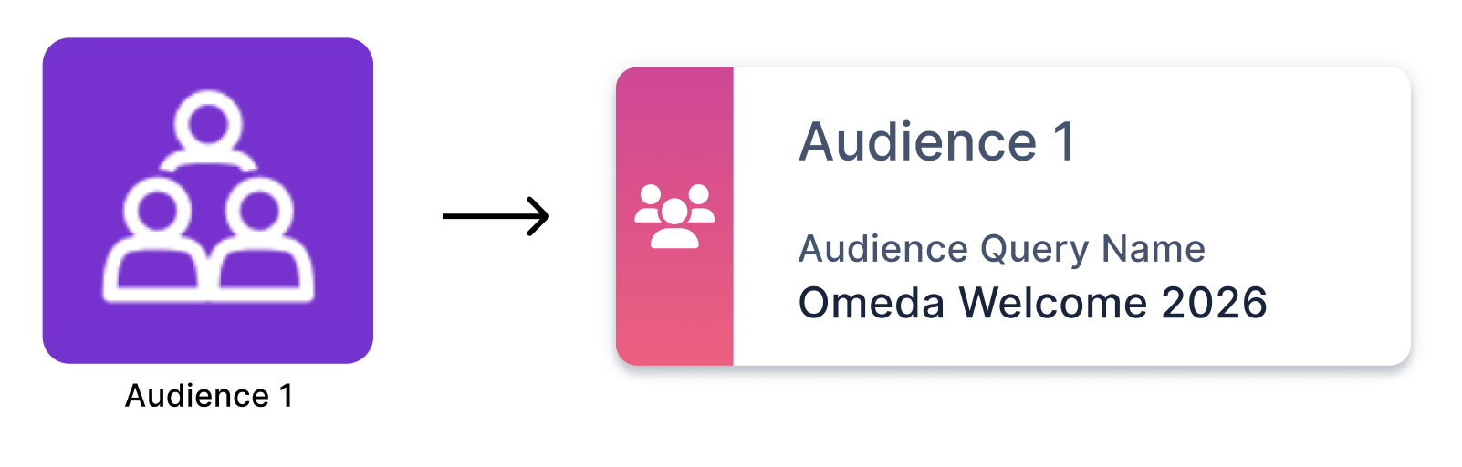
Dynamic Modals

Created a Campaign Element Library modal to streamline the campaign-building experience by making element discovery and selection more intuitive.

The modal dynamically displays only the elements relevant to the user's current stage in the campaign journey. This solution minimized cognitive load, prevented invalid selections, and improved overall workflow efficiency.

Usability Testing:
Merge Paths Prototype

Introduced the “Instant Connect” feature after usability testing three path-merging concepts: checkboxes, spotlight focus, and Instant Connect. Testing revealed that Instant Connect provided the most intuitive experience, enabling users to merge campaign paths in just two clicks.

MVP Design Features

Campaing goals: set goal met or goal limit
Encourages users to set goals for each campaign
Allows users to easily track campaign progress
Campaign status: "Report view" option
Toggle allows users to quickly view campaign reporting
Images of text were removed ("Payment" section)
Version history preview modal
Allows users to view and restore previous workflow changes
Improves error prevention during user collaboration

"Journey Builder" MVP

View more of my work